As such, below are my 3 designs:


This is my final design for the christmas card. After some thoughts again, i decided to come out with something cute instead of using shapes and colour like my previous work.
Personally i think i like this one more. =)
I used the captions: "are u lonely this christmas?" and inside: "not when you have me!!" becuase i think usually christmas is rather neglected. In singapore, we dont really have the culture to gather together to celebrate christmas, perhaps it is just a public holiday where people get to rest or maybe ask friends out, though it is getting better these days.
Also i think for winter countries, it may well be a lonely, cold christmas as the weather is cold and "unforgiving", thus people usually stays indoors, and feels more lonely.
This Card is thus designed with the idea of sending a warmth feeling to the receiver. To let someone know that he/she is not forgotten during christmas. =)

.jpg) This is my Chrsitmas card which i first did and presented to the class.
This is my Chrsitmas card which i first did and presented to the class.
.jpg) Attached above is my poster for this assignment. I have decided to do a poster to save the environment since global environment protection is in popularity now. For my design i tried to portray an image that the future of the earth and environmental preservation is entirely controlled in our hands by us.
Attached above is my poster for this assignment. I have decided to do a poster to save the environment since global environment protection is in popularity now. For my design i tried to portray an image that the future of the earth and environmental preservation is entirely controlled in our hands by us.

Meaning of "reserved":
1. kept or set apart for some particular use or purpose.
2. kept by special arrangement for some person: a reserved seat.
3. formal or self-restrained in manner and relationship; avoiding familiarity or intimacy with others: a quiet, reserved man.
4. characterized by reserve, as the disposition, manner, etc.: reserved comments.
Based on the meanings i got, i decided to explore into point 3. By using rectangles and circles, and the colour black, i created a cluster/group of pictogram guys. Then using triangles and circles, and red, i drew a girl pictogram at the corner, representing self-restrained, avoiding intimacy/familiarity, thus "reserved".


 **Pardon if the guy looks more like a monkey faced guy. haha.. cant really draw out human features.


1st level abstraction: I drew out the toilet bowl in detail and added a scope to bring out the message that is to "aim accurately" and not miss the target. 2nd level abstraction: I minus away with the water container and the pipings, focusing on the toilet bowl itself.
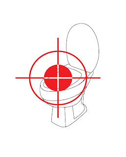 3rd level abstraction: From a 3D image, i re-oriented the toilet bowl into a 2D imageshowing just the seat and cover, forgoing the rest of the details.
 4th level abstraction: I reshaped the toilet bowl from a realistic representation into a pictogram using curves and regular shapes plus the scope. The seat area is highlighted to show the emphasis.
 5th level abstraction: Just the scope, to remind the user, please aim!!
Personally i found that i liked sketch (4) the best, and that also it looks almost like a pictogram already. Thus i decided to develop it further and make it into my final product. =)
Comments wise, because i missed the previous critique session, i think i will find another time to consult the tutor on this. =)
During the tutorial, we were supposed to present our pictogram. However i got mixed up with the requirements and thus came out with the works below:

 The sketches showed the diff levels of abstraction of a signage. At first i thought we were suppose to come up with a sign for the NUS community, and then do the same 5 levels of abstraction for it, lastly developing one of it into a final product.
So i thought of modifying the direction signs in NUS. Our NUS direction board shows only general direction and thus not very user friendly especially for "freshies". So i thought of this sign that could point physically to the direction of the place.
BUT after seeing the rest of the works during tutorial, hahaha... I was totally OUT OF POINT !!! So sorry.. Thus i didnt get any comments from the class that day as i SERIOUSLY need to redo my work to answer to the requirements.
 Abstract (1): The whole outline of the dispenser plus details of the filter etc.


 Comments: I added in the colours after the last critique session, and also skewed the shape of the logos. Not much comments was given other than someone pointed out that the "Y" could be more obvious, becuase it seems more like a "!". However the tutor commented that maybe i should consider having a background for the design rather than just white plain background. Also she said that all the borders for the letters are too uniformed. i should play around with the colours and borders more, maybe adding shades and shadows etc ..
 Comments: "Messy" was the first word that came.. haha.. And i think it looked quite true though. But i thought of giving it a messy look because it will seems like it is something i hate and since the idea is "stench". But still maybe i overdid it. haha.. Another comment was that the letters could be better represented. Colours wise, they say it may be abit too bright since it is a "I Hate", so it should perhaps be more dull looking. Comments from tutor was still the "background", leaving it empty seems incomplete. Borders wise there are variations, she said unlike the first piece of work where it is uniformed.
 Comments: The class generally said it was ok. Just that for a "I love" design, the colour was too dull (black + white). They were right, but i did not colour it because i thought it was just to show the design. My final work will be in bright colours. =) One major comment by the tutor was that of copyright, because i used logos of brands, but she said it was a good idea to merge them (mixing different identities to make one). She also said it will be fine if i could reshape the logos so they will not look like the originals yet without losing ther distinct, strong characteristics. Hmmm.. tough.. But i will try..
 Comments: They had no comments on this. This was a variation of the concept but using logos of sports team instead of brands. Some commented that it looks like a cut and paste and the logos does not merge as well as the design above. And i thought so too ..
 Comments: No much of general comments were made other than colouring it. The only problem was that the "A" and "N" was not very clearly depicted. And that the "Y" could be more obvious. But the class prefer this than the design below ..
 Comments: This was rather the same as the design above, just that it is not hanged up. Compared to the one above, the class liked the other more. Not much comments as all was said to my design above. =)
