.jpg) Attached above is my poster for this assignment. I have decided to do a poster to save the environment since global environment protection is in popularity now. For my design i tried to portray an image that the future of the earth and environmental preservation is entirely controlled in our hands by us.
Attached above is my poster for this assignment. I have decided to do a poster to save the environment since global environment protection is in popularity now. For my design i tried to portray an image that the future of the earth and environmental preservation is entirely controlled in our hands by us.The hand cuddling the small "bonsai" shows my main message, that just how we will cuddle a fragile baby and take care of it, we show "cuddle" the young plant, and preserve the future of our environment. Also it acts as a separation between the beautiful earth on the top in contrast to the destroyed earth at the bottom. I used the caption "SAVE our earth" because i think we should take ownership of our future and place of survival.
I also added a short phrase: "The earth is dying, you and I are murderers. The earth we abuse and the living things we kill, will in the end, take their revenge; for in exploiting their presence we are diminishing our future. Because we dont think about future generations, they will never forget us". Quite a straight forward quote to depict the consequences of our actions to the future generations.
Comments:
Some of my classmates pointed out that the font of the phrase is too clustered and that red is not a good option for the colour as it is not very visible. other than that nothing was said. The tutor however pointed out that we cannot use internet images, thus i think i had to remove the earth and the deforested picture below. =( No choice, so i had to make modifications to my poster. Also she pointed out that the caption spreaded abit too wide to the edge and probably too big, and suggested that maybe i could enlarge the "SAVE" and move it above the "our earth" for a try to see the effect. Overall, she said the idea of the hand was not too bad. =)


 **Pardon if the guy looks more like a monkey faced guy. haha.. cant really draw out human features.


 2nd level abstraction: I minus away with the water container and the pipings, focusing on the toilet bowl itself.
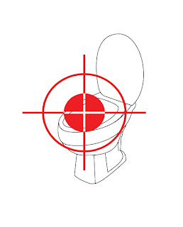 3rd level abstraction: From a 3D image, i re-oriented the toilet bowl into a 2D imageshowing just the seat and cover, forgoing the rest of the details.
 4th level abstraction: I reshaped the toilet bowl from a realistic representation into a pictogram using curves and regular shapes plus the scope. The seat area is highlighted to show the emphasis.
 5th level abstraction: Just the scope, to remind the user, please aim!!


 Abstract (1): The whole outline of the dispenser plus details of the filter etc.


 Comments: I added in the colours after the last critique session, and also skewed the shape of the logos. Not much comments was given other than someone pointed out that the "Y" could be more obvious, becuase it seems more like a "!". However the tutor commented that maybe i should consider having a background for the design rather than just white plain background. Also she said that all the borders for the letters are too uniformed. i should play around with the colours and borders more, maybe adding shades and shadows etc ..
 Comments: "Messy" was the first word that came.. haha.. And i think it looked quite true though. But i thought of giving it a messy look because it will seems like it is something i hate and since the idea is "stench". But still maybe i overdid it. haha.. Another comment was that the letters could be better represented. Colours wise, they say it may be abit too bright since it is a "I Hate", so it should perhaps be more dull looking. Comments from tutor was still the "background", leaving it empty seems incomplete. Borders wise there are variations, she said unlike the first piece of work where it is uniformed.
 Comments: The class generally said it was ok. Just that for a "I love" design, the colour was too dull (black + white). They were right, but i did not colour it because i thought it was just to show the design. My final work will be in bright colours. =) One major comment by the tutor was that of copyright, because i used logos of brands, but she said it was a good idea to merge them (mixing different identities to make one). She also said it will be fine if i could reshape the logos so they will not look like the originals yet without losing ther distinct, strong characteristics. Hmmm.. tough.. But i will try..
 Comments: They had no comments on this. This was a variation of the concept but using logos of sports team instead of brands. Some commented that it looks like a cut and paste and the logos does not merge as well as the design above. And i thought so too ..
 Comments: No much of general comments were made other than colouring it. The only problem was that the "A" and "N" was not very clearly depicted. And that the "Y" could be more obvious. But the class prefer this than the design below ..
 Comments: This was rather the same as the design above, just that it is not hanged up. Compared to the one above, the class liked the other more. Not much comments as all was said to my design above. =)


 "HATE" Sketch (2):
 "HATE" Sketch (3):
 "HATE" Sketch (4):
